Friday, August 26, 2011

More Rejected Covers

As promised, here are two more rejected covers worth examining:


Unpublished cover to Daredevil # 43 by Gene Colan


Published cover by Jack Kirby and Joe Sinnott

In this case Stan called on Jack Kirby to redo Gene Colan's cover. While Gene's version spotlights both heroes equally, Jack's cover puts Cap in the foreground, perhaps because he was the better selling character and would potentially raise sales. I prefer Gene's cover. There is a sense of fluidity in Gene's figures, with DD having the upper hand, striking Cap. In a nice touch, Daredevil has taken possesion of  Cap's shield. On Jack's cover the two heroes are about to face off, but Cap's figure is awkwardly positioned, with Daredevil drawn more attractively. Jack's cover is certainly dramatic, but Gene's is more balanced and lively, although I'm sure some of you will disagree with me (and I'd love to hear your thoughts).

Next up, two John Buscema covers:


Rejected cover to the Silver Surfer # 7 by John Buscema 


Published cover by John and Sal Buscema
It's easy to see why the original cover was rejected. It's a nicely drawn scene, dramatic on its own, but the Surfer is helpless, showing no sign of his powers. The published version features the Surfer prominently, in action and on his surfboard, blasting away at the villains while another Surfer is helpless in the background. The title "The Heir of Frankenstein!" gives you a clue to the story. John Buscema was a consummate craftsman, and its interesting to compare two versions by the same artist.  

I intend to examine more rejected covers in the future, as it seems to be of interest to quite a few folks. While I don't agree with all of Stan Lee's choices, I can see that he had definite ideas as to what worked (and sold) on a cover, and its interesting to explore those specific choices.

Other upcoming minutiae will include comparisons of unaltered stats with published covers, and cover corrections by different artists. I love studying artists styles, and I'll try to show the unique stylistic tics that stand out for me.            
  

Sunday, August 21, 2011

Rejected Covers

Since this Blog IS called Marvel Mysteries and Comics Minutiae, I thought it would be a good idea to probe into an area of particular interest to me, and hopefully of interest to a few of you as well. I've always been interested in the process of comics; growing up I was fascinated when my brother John bought a reprint comic such as Marvel Tales or Marvel Collector's Item Classics. When  he also had the original publication around, I would compare the two side by side, often noticing new coloring on the reprints. Occasionally there were alterations in art; editing of footnotes and new copy at the end of the stories. Reprinted covers were ofter recolored, figures sometimes repositioned and copy added or changed (and one day soon I'll do a post on reprint covers that used the original stats before they were changed for publication). But this post will focus on rejected covers, showcasing a few comparisons with my observations.

To get a better understanding on what the criteria was for rejecting a cover, I went to two sources that were closely involved. Stan Lee had this to say:

"I hardly ever rejected a cover because of the quality of the artwork.  Our artists were the best!  It was only subject matter and interpretation that I changed. 
I might have said: "Put the hero more in the foreground" or "Make the villain bigger"" or "Don't show the new villain's face. Let the reader guess." or "Make the scene more of a long shot."  etc.   Stuff like that.
Don't really recall any specific covers I turned down. My taste in covers was pretty much the same as Martin Goodman's.  After the first few years he left me on my own in that regard."
I also queried Roy Thomas, who kindly answered:
"I remember more about Martin Goodman's rejection of covers than Stan's... after all, if he rejected a penciled cover, it was more likely to be in the privacy of his own office, and I might never hear of it.  I see rejected covers that clearly were done during my early days at Marvel, and I usually don't recall anything about them, because Stan didn't generally discuss them with me. 

If Stan wanted to reject a cover, I doubt if I could have talked him out of it.  I do recall him being unhappy at seeing the bottom of Captain America's boot (the sole) on the cover of GIANT-SIZE INVADERS, and he wanted to get the foot redrawn so we'd see the top of it.  That would've made him look like he was putting his best toe forward, so I managed to talk him out of that... but he never liked seeing the bottoms of hero's shoes on covers.  I've mentioned I think that's why he rejected one CAPTAIN AMERICA cover by either Kirby or Romita that's floating around... although I don't specifically remember that cover otherwise.

As editor-in-chief, I had pretty much control over the covers, although Stan as publisher could overrule me as Goodman had him... and perhaps he did, once or twice, but nothing I particularly recall."
And now, on to a few covers:
The rejected cover to Amazing Spider-Man # 35, as published in Italy
The published cover to Amazing Spider-Man # 35
A side by side comparison clearly shows that Ditko's Spider-Man figure was redrawn by Jack Kirby, with inking likely by Sol Brodsky. This cover came up in a phone conversation I had with John Romita some years ago. He recalled he was in the office when Kirby was fixing the cover, and Kirby was joking that he always had to fix Ditko's butts. It's obvious that either Stan or Martin Goodman did not think Spidey's rear facing the viewer was attractive, and Stan had Jack make the change, likely because he was in the office. While the original does have a charm, as S-M is descending from above,  the replacement figure is also dramatic, as he races towards a confrontation.
Kirby's covers were also rejected from time to time, and here is an interesting example:
Rejected cover to Thor # 167; Jack Kirby pencils; Vince Colletta inks

Published cover to Thor # 167 by John Romita
The changes here are interesting and clearly illustrate Lee's points. Kirby's version is busier, although the main idea of Thor's ghostly figure looking on helplessly as his alter ego is threatened by Loki appears in both versions. That scene is much smaller in Kirby's version, as we also witness the inside of a hospital where doctors are administrating to one of Thor's comrades. I like the look of urgency on Thor's face on Kirby's unpublished cover, but realize Romita's figures taking center stage is more dramatic in the published version and a perfect example of Lee's intentions for a successful cover:

"Put the hero more in the foreground..Make the villain bigger!" 

As a matter of expediency Lee often had John Romita redo covers since he worked in the office and deadlines loomed.
I intend to compare a few more examples soon, so stay tuned. 
     

Sunday, August 14, 2011

Musings on the great Wally Wood


I'll always associate Wally Wood with artistic titans Jack Kirby and Steve Ditko. All three worked for Marvel in the magical year 1965; all three were highly distinctive and totally involved in their visions. Wood’s work at Marvel was minimal, seven issues of Daredevil and assorted inking jobs, yet he left an indelible impression on my mind. His art had a brilliant gloss to it, a fairy tale quality that drew you in. His figures were heroic, his women curvaceous (despite restrictions by the Comics Code, Wood's Karen Page exuded sexuality); his machinery detailed and shiny. 


My earliest Wood memory. Daredevil # 9, Aug 1965
 

Wood was always around in the 1960s and 1970s, although you’d never know where his art would pop up. After he quit Marvel, Wood was the prime player at Tower comics, writing stories, drawing, inking and providing layouts for other artists. His covers for Dynamo, Thunder Agents, Noman and Undersea Agents were striking in their simplicity. Wood also worked for DC, Warren, Gold Key and showed up for another short stint at Marvel in the early 1970s, He produced artwork for Science Fiction mags, book covers and Topps bubblegum cards. He did commericial work for TV Guide and ads for Alka Seltzer. 


Dynamo # 3, March 1967


Wood published witzend, a fanzine which was instrumental in not only giving creators an opportunity to go outside the restrictions of the Comics Code, but to own their creations.  Artists such as Steve Ditko came on board, originating Mr. A. Wood's fantasy worlds were populated with odd little figures, monsters, gremlins and elves that sprouted from his subconcious. There was a child like quality to much of his work, a kid inside of Wood that had to escape. Much of his cartoonish art seemed tailor made for animation, but although copied, the original rarely made it to the screen.     


Wood's offbeat imagination at work


Wood's inking was exquisite. Everyone looked great rendered by Wood: Gil Kane, Gene Colan, Mike Sekowsky. Some say his style  was overpowering, but I saw his collaborations, especially when paired with Ditko and Kirby, as a blending of elements. Wood understood what was important in the pencilled stage. He enhanced but did not dilute.


Jack Kirby pencils, Challengers of the Unknown # 8, July 1959
 
Gene Colan pencils, Captain America # 126, June 1970 


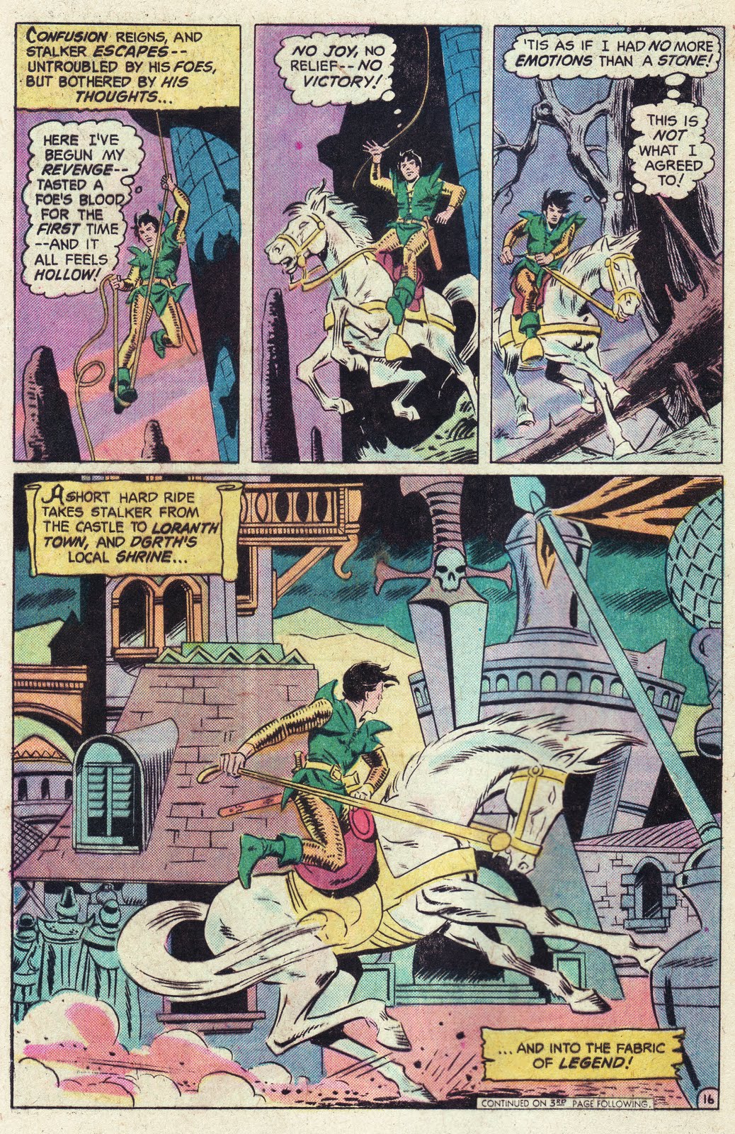
Steve Ditko pencils, Stalker # 1, July 1975 
  
By the early 1970s I became aware of Wood’s past and reveled in the many reprints of his brilliant EC work, including his science fiction classics, and Mad, where his satirical side exploded in all directions. The impish, child-like humor would continue into his self published work and remain an essential element throughout his career.


The Spawn of Venus


I distinctly recall reading about Wood’s suicide while riding on a bus in 1981. It headlined the news in the Buyers Guide, and columnist Cat Yronwood devoted a good deal of her column to Wood's life and career. Wood’s passing shook me up, particularly due to the way he died. A true tragedy, it instilled an awareness that my favorite artists and creators were human and would not be around forever. Now, all these decades later, only a handful remain.


It was also a great loss because Wood was still relatively young, but not having taken care of his health, he wore down quickly. Like some of his brilliant peers, Wood lived in his own world, and anything he considered outside interference - notably editors - was an irratant. He stood on the outskirts of comics, looking through the windows and gazing at the clouds. His imagination took him to distant galaxies, or worlds where odd little creatures ran rampant, but the special qualities of Wally Wood can only be admired by us normal folks.

                               
                    I’m glad he stopped by to entertain us for a spell.  


The King of the World, 1978


To learn more about Wally Wood's art and career I highly recommend visiting
Horray for Wally Wood
which is linked on my bloglist.

A special thank you to Barry Pearl for technicolor assistance  


Wednesday, August 3, 2011

What Made Marvel Different?

Over at Timely-Atlas Yahoo Groups there has been an ongoing discussion on whether Stan Lee was aware of his competition at DC, how closely he copied their characters and how it affected Marvel's line-up. Of course Stan was aware of the competition, as was Publisher Martin Goodman, but no matter how influenced they were, in the final analysis it is the differences - not the similarities - that made Marvel stand out.   

Marvel in the 1960's was completely different from DC (and their other competitors) in so many ways. Their covers used darker tones; more grays, purples and gradations, courtesy of colorist Stan Goldberg. Stan Lee's cover copy was flamboyant and melodramatic, but he added self-referential touches and humor that connected with his audiences ("If you don't like this comic, you might enjoy Millie the Model").


Journey into Mystery # 106, July 1964. Jack Kirby pencils, Chis Stone inks, Sam Rosen letters and Stan Goldberg coloring.

Lee's playful cover copy set the tone for Marvel's distinct personality. 


Strange Tales # 122 July 1964 Kirby pencils; Sol Brodsky inks (and likely alterations); Ditko Dr. Strange vignette. Lee copy.


The art was rougher and less polished than the clean-cut look exemplified by Curt Swan and Carmine Infantino at DC. Their style had a suburban feel; the streets were immaculate; houses and lawns perfect. Even their villains looked dapper and less threatening. Kirby and Ditko's world was distinctly urban. Marvel's heroes fought in the streets, rooftops and alleyways of New York, where garbage pails, fire hydrants and tenements existed and water towers loomed high above. An apt comparison would be to movie studios of the 1930s and 1940s. DC echoed the elegance of MGM; Marvel the rough and tumble features of Warner Brothers. 


The FF creep through the grungy side streets of New York (Yancy Street was a recurring gag in the series; The Thing had grown up on the block and the "Yancy Street Gang" were his unseen foils) Jack Kirby depicted these scenes from first hand experience, having grown up on the Lower East Side. Dick Ayers thick brush strokes perfectly accompanied Kirby's pencils. Fantastic Four # 20, November 1963.


Speaking of Warner Brothers, William Wellman could have directed a scene like this! Mobsters, cops and piers as Ditko brings aspects of crime thrillers with impeccable skill. Amazing Spider-Man # 27, August 1965.  


The Flash races through squeaky clean, picture-perfect streets; a jarring contrast to Kirby and Ditko's age-old buildings and cracked pavements. Carmine Infantino pencils, Joe Giella inks, Flash # 130 August 1962.


Marvel's characters looked nothing like the clean-shaven heroes that populated DC, Dell or Archie; the Thing, the Hulk, Spider-Man, Thor, Sgt. Fury were a ragtag bunch: faces concealed, long haired, a pair of monsters, some in ripped shirts and pants - hardly a conservative looking group. What Stan, Jack and Steve did was take surface elements of the traditional superhero and refashion them, creating a harder-edged product.

Growing up in the 1960's I had the opportunity, thanks to my older brother John, to read comics from a variety of companies:DC, Gold Key, Tower, Archie, Charlton - I never confused one product with another (even Archie's Mighty Comics line, which tried very hard to mimic - some would say outright confiscate - Marvel's look, didn't fool me at 6 years old). We did read more Marvel's product on a steady basis, attracted by the ongoing stories, sharp writing and superb storytelling. Lee, Kirby and Ditko were the core group, but Wood, Romita, Colan, Buscema, Heck, Ayers and an array of others contributed to a special moment in the world of comics. They were different not because Martin Goodman followed competitors sales figures and asked for similar titles (something he did throughout his life as publisher), but due to the creativity and individuality of the creators working for him. Without them, Marvel's line would likely be a footnote in comics, recognized only by the few interested in such minutiae.