Sunday, February 26, 2012

Unaltered Reprint covers

Ever since I can remember I've been fascinated by the process of comics: how they're put together. Pencils, inks, colors, lettering, editing, production. Early on I had an ability to notice alterations in artwork. I was a lad of 10 when Kirby moved to DC and Superman and Jimmy Olsen's redrawn faces stuck out like a sore thumb. Or, at Marvel, Romita faces were sometimes on Kirby's women, or a Marie Severin or Herb Trimpe face or figure would show up in a George Tuska or John Buscema story. I was particularly interested in comparing changes that occured in reprint titles such as Marvel Tales or Marvel Collector's Item Classics. I often took out the originals from my brothers collection and discovered that the entire story was often recolored, or there were sometimes changes in copy. Covers were particularly interesting, since the originals were often restructured in some form, either cropped, images flopped or copy added or deleted.

While many covers were new versions by different artists, especially in the 1970s, including Gil Kane, Sal Buscema, Marie Severin, Jim Starlin, John Buscema and Ron Wilson, the originals were also used, but sometimes there were subtle differences. Some of the covers, it turned out, were not the original publsihed covers, but stats of the covers before they were changed in production. There were changes big and small that occured, and I thought it might be interesting to doccument some of them.

Fantastic Four # 68, Nov 1967, Kirby/Sinnott


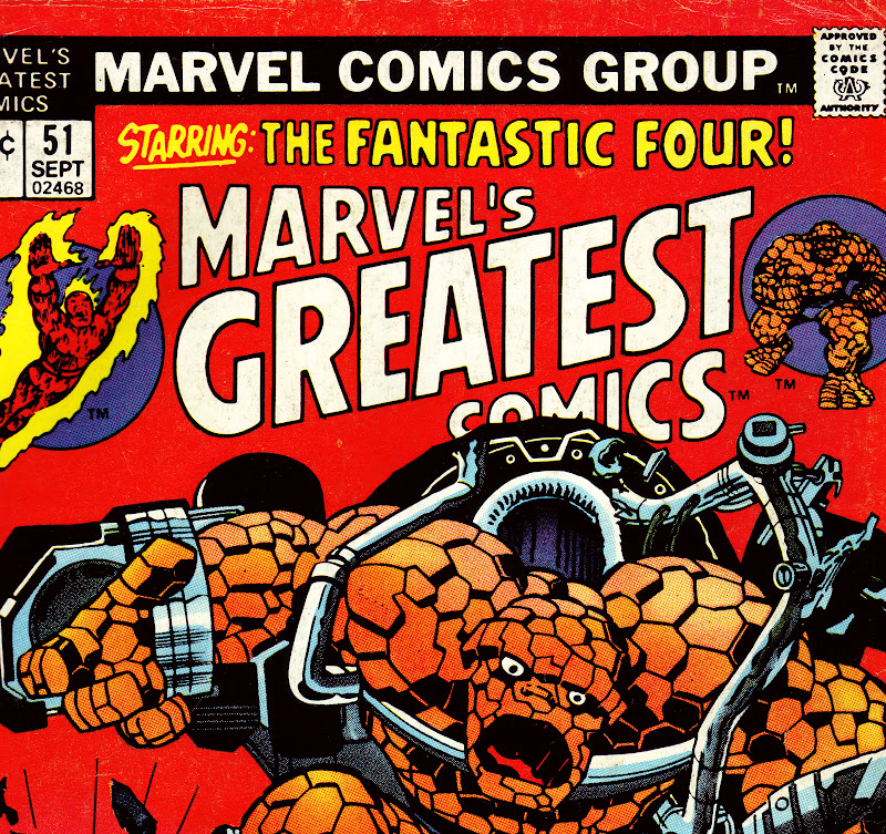
Detail to Marvel's Greatest Comics # 51, Sept 1974


The above example is one of the, um, minute changes that sometimes appeared and could easily escape detection. In the original published version the Thing's mouth is smaller than the stat that was published on the reprint. Why the change? Did someone think the Thing as originally depicted looked too frightening? The coloring on the reprint appears to obscure some of the machinery, but I don't think there are many alterations from the original, although on both versions Marie Severin may have touched up some of the machinery directly above the Thing's head.   

Fantastic Four # 70, Jan 1968 Kirby'Sinnott/Romita alterations


Marvel's Greatest Comics # 53, Nov 1974 

Kirby's original drawing reveals a number of differences from the printed cover. Sue's figure on FF # 70 was positioned to turn in the direction of the Android. Romita redrew parts of Sue's waist and leg's, as one can see from the way the lines on her skirt are drawn. Also, Johnny was originally drawn without the flames emanating from his body. Some of Sue's figure is covered on the reprint because the original copy was moved in order to add an additional caption on the upper left. In the 1970's editors often felt the need to add more captions or word baloons, making the covers cluttered and less dramatic.


Thor #129, June 1966 Kirby/Colletta


Marvel Spectacular # 2, Sept 1973
In the original Thor cover Stan decided to eliminate the architecture in order to focus on the three figures. This turned out to be a good idea, as the black background was more dramatic and attractive. The Marvel Spectacular cover had to crop the images a bit in order to fit the bigger logo. 


Fantastic Four # 71, Feb 1968, Kirby/Sinnott


Marvel's Greatest Comics # 54, Jan 1975 

As you can see, Marvel used quite a few unpublished stats in this period on their reprints. It is interesting to compare the two versions. In the published FF cover Stan again choose to simplify the background elements, eliminating most of the details on the left side of the cover (Reed and Johnny). Only the outline of a bulding appears by  Reed's figure, and Johnny's flame was altered so as not to cover the android's face. The burst in between the characters and the blurb was also cut out. The MGC cover cropped the Sue section in order for the logo to fit, but I find the composition of the burst more attractive  than the published cover version.
    
Thor # 133, Oct 1966, Kirby/Colletta/Romita alterations? 


Marvel Spectacular # 4, Nov 1973

The face of Ego was changed considerably on the published Thor cover, perhaps by John Romita, although I'm not certain. Stan must have felt that Ego's face looked too normal and wanted a more otherwordly look. I was comparing these covers with my brother John, who felt the published Thor cover looked better than the Marvel Spectacular stat. I believe minor alterations may have worked better, perhaps deleting the beard. I do like the way Kirby drew the eyes.


Captain America # 101, May 1968. Kirby/Shores/Romita alterations


Marvel Super Action # 2, July 1977 

Finally we come to a cover that was not not changed due to editorial choice, but by the demands of the Comics Code. Roy Thomas has explained that the Code was very touchy about the depiction of the Skull, and early on made it clear that the Skull's face should look like a mask, not a real skull. Kirby apparently forgot that demand when he was drawing the original cover, and John Romita was called on to make the Skull acceptable. By 1977 the Code had softened enough for the cover to appear on Marvel Super Action. The stat also has a few background elements that are a little different, and the title had to be relettered so that the UPC code could fit on the lower left hand corner.

Those are a few of the covers that were used on reprints in the 1970s. There are quite a few more, and I may detail some of those on a future blog post.   

Wednesday, February 15, 2012

John Powers Severin - An Appreciaton

"I've always been interested in people's faces. I've tried to study the types you see in various occupations or in the differences that show up with racial groups. Yes, I reckon the face is the best way to show character, but there's plenty of other things that go along with it. The hands - for example -- the way a man uses his hands shows how his mind is really working.  You can control an expression on the face, but the hands give it away. Then there's the way a character is dressed or his way of posturing."    

John Severin interview with John Benson, Graphic Story Magazine # 13, spring 1971

Beginning in 1947, and only ending recently with his passing (February 12th, 2012), John Severin had been drawing comics - and drawing them with distinctive finesse - for over sixty years. Quite an accomplishment by any standard.

"Dien Bien Phu", Two Fisted Tales # 40, January 1955. 
Severin was an artist who didn't get a lot of attention, perhaps because he was never too involved or interested in super-heroes, preferring genres rooted in a realistic background: western, war and period pieces.  Severin also spent many years working on humor strips for Cracked, and was never associated with a single character for long.  Nevertheless, Severin was one of those artists, like Russ Heath and Joe Kubert, who turned out superior work year after year.
Kid Colt, Outlaw # 84, May 1959. Severin draws you  into the scene. Severin, along with Joe Maneely, Russ Heath and Bill Everett, drew some of the most exciting covers for Atlas.


Caught # 4, Feb 1957. Severin contributed a  number of spectacular covers for Atlas' crime titles, which deserve to be collected in a Masterworks edition (you listening, Cory??)


I probably first took notice of Severin's work when he took over the artistic chores from Dick Ayers on Sgt. Fury for three issues (#'s 44-46).   


Sgt. Fury # 45, August, 1967. The expressions and body language on the characters speak volumes.

Severin continued on Sgt. Fury for a long run, inking Dick Ayers pencils, adding authenticity and detail. Severin's inks were exquisite on everyone, from Herb Trimpe to Ross Andru. Of special note is his collaboration with sister Marie on Kull.


Two-Gun Kid # 103, March 1972; Gil Kane pencils. 

Captain Savage # 16, September, 1969. Don Heck pencils. The only time Severin inked Heck.


I began to fully appreciate Severin when I discovered his earlier work, in reprints of his EC war and humor stories for Mad. As I became interested in collecting pre-hero Marvel's in the 1980s I bought many westerns at conventions, attracted by Severin's exceptional covers. All the while Severin continued to work for companies such as Warren, the short-lived Atlas/Seaboard line (in the magazine Thrilling Adventure Stories), and DC, on "the Losers", "Unknown Soldier" and "Enemy Ace" to the recent Bat Lash series. It was always worth checking out anything Severin drew since the quality of his art continued to remain high.


Western Gunfighters # 9, May 1972. Severin produced many covers for Marvel's western reprints on the 1970s and they are well worth seeking out. Severin also drew the sidebar characters.


John Severin was a rare breed that turned in exceptional work day in and day out. Never flashy, his art had a quiet integrity which stands the test of time


Tuesday, February 7, 2012

Stan Goldberg – Prince of the Palette

Stan G., as he became popularly known at Marvel in the 1960s, was both proficient and highly skilled, coloring covers and interiors, and inventing the color schemes for the Marvel Super-Heroes, including Fantastic Four, Spider-Man, the Hulk, Thor, X-Men, Daredevil, Iron-Man and Dr. Strange. Goldberg was not only a stunning colorist, but also a solid artist in the teen-humor/romance line, including a long run on Millie the Model. Goldberg used his limited palette to produce a distinctive look for the Pre-Hero Marvel and Marvel Age line-up. His use of solid colors, gradations and "knock-outs" (a term used to describe the use of a single solid color in a panel) was exceptional, and Editor Lee had a trusted and professional staffer to rely on.


The "Knock-Out" from "The Clock Maker" Strange Tales # 96, May 1962, Ditko Art

Kid Colt Outlaw # 97, March 1961 - Kirby-Ayers Art. Goldbergs's coloring of the prisoners in the foreground in solid gray, along with white space, adds emphasis to the hero, Kid Colt.
Goldberg began working for Timely as a teenager, drawing stories and coloring. He soon took over the coloring department and remained with Marvel until 1968, when he moved over to drawing for Archie and DC. At Marvel, Goldberg added a quality of mood that suited the line. Very different from DC’s primary colors, Goldberg used grays, purples and dark greens to great effect, especially in the monster and fantasy stories of the late 1950's and early 1960's. His monsters all followed similar color schemes; oranges, grays, browns - making them stand out (as can be seen in my post Monster's at my Window) . 

This sense of mood continued with the Marvel heroes, fashioning a distinctive company look. Goldberg's work followed a pattern: the villains were adorned in greens and purples (Dr. Doom, The Mandarin, Loki, Mysterio, the Frightful Four); the heroes in blues, reds and yellows. Lee's Marvel line-up developed a consistent look, down to the lettering and coloring. Goldberg, like Artie Simek and Sam Rosen (see my previous post for more on both men), were professionals who created a body of work than can be admired and appreciated, especially since it was done on a deadline.
Amazing Spider-Man # 23, Apr 1965, Ditko art. Notice how Goldberg did not color Spider-Man's costume in solid red or blue, instead using shading to provide depth, as he did on many of the Marvel characters .
Avengers # 23, Dec 1965, Kirby-Romita Art. Goldberg's coloring of Kang adds dimension to the cover and contrasts with the colorful Avengers.


FF # 47, Feb 1966. Kirby-Sinnott Art. Beautiful use of grays to emphasise the heroes, with the red of the Torch standing out. 
X-Men # 16, Jan 1966, Kirby-Ayers cover. Kirby's 3-D art is enhanced by Goldberg's reds and yellows. The purple logo stands out. 
Tales of Suspense # 80, Aug 1966. Kirby-Heck cover. Another beautiful combination of colors, especially the yellows and greens.

Sgt. Fury # 16, March 1965, Kirby-Stone art. Goldberg's use of yellow in various gradations makes the reader literally feel the heat and exhaustion that Kirby vividly depicts on the Howlers.

Stan Goldberg is one of a kind. Versatile, inventive and charming in person, he is part of a special era in comics, when a few very intelligent and talented people got together and made comic books that are worth revisiting. While comic book production has changed and improved over time, and coloring is now done on computer, with endless choices, the old school of Goldberg and his peers were able to do more with less, and often accomplish much despite the drawbacks. They tower above the rest as examples of some of the best in the field.          

Amazing Spider-Man # 39, Aug '66, Romita cover. One of my earliest memories of a comic book I  took notice of on the comics rack, the brilliant gradations of light blue to purple immediately caught my attention and remains a favorite.