Thursday, November 2, 2017

Covering Ditko

The artistry of Steve Ditko has been captivating comic book aficionados for over six decades. One aspect of Ditko's oeuvre worthy of further study is his facility for crafting compelling cover art (akin to a movie poster, a comic book cover was of paramount importance in capturing a prospective customer's attention). From the outset Ditko had the ability to depict -  in a single frame - a moment which simultaneously drew in the viewer and encapsulated the interior narrative, quite often with extraordinary results. I've endeavored to assemble an array of outstanding covers culled from throughout his career that I believe personify Steve Ditko's mastery of visual expression. You've heard the saying "A picture is worth a thousand words", I assert these pictures speak volumes and will hopefully sway a few newcomers to the fold.      


                         Strange Suspense Stories # 18, May 1954 

Ditko's earliest covers adorned Charlton Press, where he immediately stood out as a young talent to be reckoned with. While his more grisly illustrations are often recognized by fans, I prefer those that emphasize mood and tension. The above scene is a classic example of simplicity in design, where one observes an extreme close-up of a woman's face aglow with terror while a shadowy figure leers at her from behind. The trees, falling leaves and moon complete the picture, further complimented by the unknown colorist's subdued tones.   


                                The Thing # 15, July-August 1954


Ditko's gigantic, drooling worm creature devastates an urban metropolis. The buildings, skylight, billboards and water tower reference a recognizable Manhattan landscape (one familiar to both the artist and his audience). In the years ahead Ditko would continue to incorporate his surroundings into many of the stories he illustrated, all with great skill and personality.


This Magazine Is Haunted Volume 2, number 12, July 1957

Horrific elements such as the one seen on The Thing # 15 were commonplace in comics, but that all changed when the Comics Code was instituted in late 1954. Ditko adapted to the restraints by placing an emphasis on atmospheric scenes that evoked a sense of menace. Here host Dr. Haunt approaches a foreboding house on a windswept night. 


                  Tales of the Mysterious Traveler # 4, August 1957
The image of the Mysterious Traveler standing under a street lamp as wisps of paper fly in the air (and are used to spotlight the interior stories) are indicative of master cartoonist Will Eisner, particularly his masked crime-fighter, The Spirit, who appeared in newspapers in the 1940s and 50s. A superior storyteller and craftsman, Eisner was one of many artists whose work was absorbed by Ditko. Subtle touches abound on this cover, such as the host's face appearing behind him on a billboard with the words "in this issue" barely noticeable.       


                                      Unusual Tales # 9, November 1957
Pedestrians reacting to a most unusual snowstorm is a superb example of Ditko playing with emotions, expressions and body language. Little touches, such as showing the families breath in the cold air, are particularly noteworthy.       


                            Out of This World # 6, November 1957   
Unusual cover concepts are another demonstration of Ditko's prowess in choreographing a scene for maximum effect. Incorporating four elements (the floating figure, a circular motif, amorphous dripping fog and "stepping stones") foreshadows the world he later developed in Doctor Strange.


                   Strange Suspense Stories # 35, December 1957

It's hard to conceive that Charlton editor Pat Masulli had anything more to do with this cover other than approve it, especially since there are no corresponding stories inside the issue. Ditko's quirky imagination is manifested by an eerily effective drawing - a man trapped inside a light bulb surrounded by moths, whose size and perspective add depth to the scene. Comic books have influenced a host of filmmakers in ways both obvious and subtle; perhaps director Jonathan Demme, with his disturbing moth imagery in The Silence of the Lambs (1993), is one such example.   


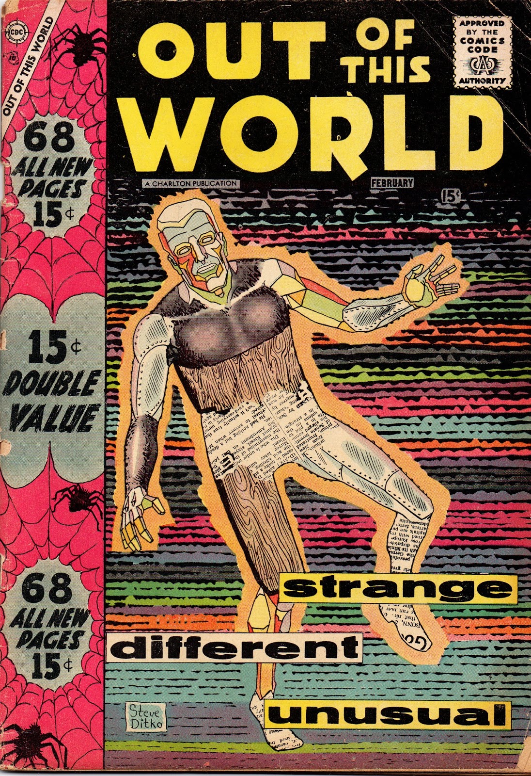
                      Out Of This World # 7, February 1958

"Strange, Different, Unusual" are the key words on this cover and Ditko follows through by drawing a figure composed of glass, plastic, metal, wood - even part of a newspaper! (Ditko would incorporate newspaper headlines and articles in his Avenging World series a decade later). The spider-web design on the left side is a harbinger of things to come; four years later Spider-Man came into existence under his tutelage.   


                Mysteries Of Unexplored Worlds # 11, January 1959

Ditko seemed fascinated with water-based concepts and incorporated them into many of his cover scenes in this period. This is one of his most fanciful efforts, enlivened by an arresting color scheme.  


                             Amazing Adult Fantasy # 13, June 1962    
By the late 1950s Ditko was becoming increasingly busy working for Editor Stan Lee at the nascent Marvel Comics (while his Charlton output lessened, Ditko always managed to freelance for the company). Jack Kirby was Lee's go-to artist for the majority of covers, but Ditko had a proven track-record in crafting fantasy-oriented visuals, taking up the slack whenever Kirby became overwhelmed. Lee recognized the virtue in Ditko's unconventional approach to storytelling and relished collaborating on their mini-thrillers (Ditko has stated that - from the beginning - he worked from a plot synopsis furnished by Lee). When presented with an opportunity to more fully exploit Ditko's creativity, Lee seized it. Amazing Adventures, a borderline seller, was overhauled with its seventh issue (December 1961); Lee restructured the title, adding two words that promised a more serious approach, Adult Fantasy, and for added effect, devised a dramatic sub-title "The magazine that respects your intelligence". It was here, for the first time, that Lee and Ditko worked exclusively on an entire comic. Ditko was also given the all-important cover assignments, one of the standouts being AAF # 13, where a menacing figure, seen from behind, rises out of the sea and onto a dock; in the background a mist-shrouded city becomes a "character" awaiting the unknown. 


                          Amazing Spider-Man # 2, May 1963

In Robin Snyder's publication, The Comics (Vol 13, No 1, January 2002) Steve Ditko, wrote about this cover in A Mini-History: The Amazing Spider-Man # 2: 


"The Amazing Spider-man #2 (May 1963) featured my first penciled and inked Spider-man cover. It showed an air battle between S-m and the villain, The Vulture. The cover also had an insert involving the second villain, The Terrible Tinkerer (and contains my addition of spider webbing to the title and my idea for the Marvel hero head box in the top left corner)." 
Ditko's stellar run as co-plotter/plotter/artist on Amazing Spider-Man has been discussed countless times - and deservedly so - but his contributions as cover artist are also of great importance. I will post just a few of my favorites here, beginning with his first full cover art (Jack Kirby penciled the published covers to Amazing Fantasy # 15 and Amazing Spider-Man # 1, with Ditko inking). Spider-Man being menaced by a villain who possess the ability of flight, with the towering Manhattan skyscrapers serving as backdrop creates palpable suspense. Stan Goldberg's choice of an all-gray color scheme emphasizes the two opponents skillfully, and the inset drawing is efficiently utilized to preview the second story.
                       Amazing Spider-Man # 15, August 1964

This cover drew me in all those years ago when I first saw it and it's STILL a favorite. Ditko creates palpable tension by showing the reader a vulnerable hero who appears to have no chance of escape. How does Spidey get out of this predicament? Back then it would cost you 12 cents for the answer, and I suspect quite a few perusing the newsstands for entertainment made that purchase. 


                         Amazing Spider-Man # 22, March 1965

On many of these covers you'll notice that dramatic situations supersede conventional fist-fights. Ditko was quite capable of drawing a rousing brawl, but he often concentrated on reaction instead of action. Here the "leading man" is missing; instead his looming shadow and calling card (the Spider-Signal) announce Spider-Man's symbolic presence to both the startled villains and his prospective audience. While early on Lee discussed and worked out cover designs with Ditko, according to the artist there came a point where he produced covers on his own, with no input from Lee.      


                         Amazing Spider-Man # 24, May 1965

Spider-Man is haunted by ghostly images of old foes Sandman and the Vulture; a man whose desk appears to be on the ceiling and an off-kilter perspective that compels the viewer to question exactly WHAT is going on in this bizarre psychodrama.


                     Amazing Spider-Man # 28, September 1965

 Experimentation is another aspect of Ditko's cover-art, as evidenced here. The all-black background has Spider-Man blending into the darkness with only the red highlights of his costume standing out as The Molten Man's shining figure advances. This was not your typical superhero cover. 


                      Amazing Spider-Man # 33, February 1966

Superlatives escape me when trying to describe this cover. Like a perfect game in Baseball the components are visible but you are in awe over the end result. An understated masterpiece by Ditko. 


                      Beware The Creeper # 2, July-August 1968

The Creeper's pose, along with the villain lurking above, interact with familiar Ditko tropes: rooftops, rain and a city background.  


                          Eon # 3, 1969. Mr. A copyright Steve Ditko

While this Mr. A illustration was used as the back cover for Rob Gustaveson's fanzine, Eon, I thought it was a good example of Ditko's visual perspicacity and therefore included it. The attractive Mr. A logo design, encompassed by an almost abstract building motif and Ditko's signature leads into his "good/evil" card, the fool skirting the edge and Mr. A's omniscient figure.    


                           Haunted # 1, September 1971

Ditko showcases the interior stories in a decidedly offbeat manner: composing each scene inside two huge eyes and a mouth. 

                          Ghostly Tales # 89, October 1971

Ditko's visual symmetry is fascinating. On this cover he uses optical and circular images to create an illusion of depth that entices the viewer.  


                  The Many Ghosts of Doctor Graves # 28, October 1971 

Host Dr. Graves presents the feature story on a parchment, holding it up for the viewers to observe. Ditko incorporated the entire cover, including the logo in the design. The candle, bricks and figure seemingly extending beyond the page, creating a three-dimensional quality.


                             Haunted # 2, November 1971 

A man floats in space, surrounded by a montage of faces and figures enclosed in a circle (as we have seen, the use of circles and circular images is a constant in Ditko's art). Charlton Press was an ideal place for Ditko to tinker with an array of techniques, and covers were no exception. Nick Cuti, who was an assistant editor at Charlton in the 1970s, had this to say on Facebook when I asked about the cover process:  


"at Charlton as far as I can remember all the covers were assigned after the story had been illustrated. We had stacks of finished stories on metal shelves. I was assigned to put together an issue and then an artist was assigned to do a cover for the issue."   


                         Ghost Manor Volume 2, # 4, April 1972 

Ditko combines several diverse elements to satisfying effect on this cover. A startled man and host Mr. Bones appear in a living room setting, superimposed against a ghostly apparition and a raging sea. 


                 The Many Ghosts of Doctor Graves # 31, April 1972

A succession of images devised as index cards. Another unorthodox presentation by Ditko. 


                          Ghostly Tales # 103, April 1973

The trademark Ditko fingers open a door, revealing a frightening and deadly secret! A few years earlier this cover would almost certainly have been rejected by the Comics Code, but in 1971 the rules were relaxed, leading to more horror-oriented fare.   

                       Ghost Manor Volume 3, # 15, October 1973 

Barbed wire undulates across the cover, giving the viewer a feeling of entrapment and creating a sense of tension.


                           Daredevil # 162, January 1980

The covers Ditko drew when he returned to freelance for Marvel in the late 1970s were usually not as strong as his earlier efforts, likely due to tighter editorial control and/or others providing a composition for the artist to follow. Although a little awkward, Ditko's positioning of the criminal's knives help guide the viewer's eye to Daredevil and his predicament.   


                                   The Fly # 8, August 1984

Ditko had a run on Archie's The Fly in the 1980s but his covers were watered-down when management refused to let him ink them. Ditko's last issue was an exception, and the artist comes through with a scene of the Fly caught in a deadly situation. 


 Steve Ditko's Static Chapters 1-5, July 1989. Static copyright Steve Ditko.

In 1988 Ditko began producing his independent work with co-publisher Robin Snyder, a relationship which continues into the present. One of their earliest efforts was a reprinting of Ditko's Static, an intriguing hero with a visual flair. His story came to a conclusion in the second volume. Ditko's scene of Static surrounded by a montage of criminals is heightened by his sharp inking and use of blacks. 


                             3-D Substance # 1, 1990

Early in his career Ditko assisted Joe Simon and Jack Kirby on their Captain 3-D comic, and, as a few examples I've shown here prove, Ditko picked up some pointers on creating images that leaped off the comics' page. 


                     The Mocker, April 1990. Copyright Steve Ditko.

A sea of individualized faces accompanied by an array of expressions is another Ditko trademark that distinguishes this cover. The Mocker was a "graphic novel" and one of Ditko's best self-published concepts. 


                         Curse of the Weird # 1, December 1993
                        Monster Menace # 3, December 1993

Ditko drew a few covers for Editor Mort Todd's reprint line of Atlas horror/monster stories from the 1950s and early 60s. Ditko not only penciled and inked the covers, but provided the color guides as well. 


     OH No! Not Again Ditko! March 2009. Copyright Steve Ditko. 

Ditko's satirical side comes to the fore on this unusual cover, with the main concept of an ink bottle spilling its contents over the page and employed as a framing device. 

          Act 7, Making 12 of Ditko's 32's. Copyright Steve Ditko. 


 Act 8, Making Lucky 13 Ditko's 32's. July 2011. Copyright Steve Ditko. 


                      # 25, March 2016. Copyright Steve Ditko. 

In his later work Ditko has taken on a stripped down, minimalist approach to his art (another nonconformist, sculptor Donald Judd, might have exuberantly approved!) although his sense of design, composition and playfulness remains in evidence, as do his signature tropes, including the eyeball, cover montages, water towers, bizarrely attired characters and creative costume designs.  

For over six decades Steve Ditko has not only produced countless stories and invented an army of characters, but a great many of his covers are noteworthy as examples of an artist thinking about how best to craft a singular image. The choices made by Ditko are indicative of an artist who doesn't take the easy way out. It is another accomplishment that puts him in the pantheon of a true original in the world of comic art. 


Speaking of Ditko, The Amazing Spider-Talk Podcast asked my to speak about one of my favorite comic book creators. Here is the link:


In acknowledgement of two men who provided inspiration in the study of Ditko's cover-art: Michael Wileman, whose 1982 publication, A 50s Ditko's Cover Gallery, introduced me to many previously unseen Charlton covers, with fascinating commentary on each one, and Robin Snyder's The Cover Series (September 2010), showcasing a plethora of Ditko covers, some unpublished or taken from original stats.    

Saturday, August 26, 2017

Neighborhood Book Shops and the Thrill of Collecting Comics

During the 1960s and into the early 1970s it was commonplace for a neighborhood in New York to have stores that had no exact classification. A segment of these establishments also bought and sold used books, magazines, records, coins, stamps, war memorabilia and assorted ephemera. Of the ones I frequented in Brooklyn and Queens many were owned by middle-aged (or older) couples. The interiors also shared similarities; cluttered, dusty and often unorganized, but with a sense of wonderment and surprise. Who knows what treasures might lurk within the ruins?

For those like my brother John, it was a place to seek out old or missing comic books to add to his collection (in those days my older brother did all the buying while I reaped the benefits!). Virtually every store had their comics displayed on wooden or metal shelves in stacks that were easily accessible. They were not wrapped in plastic and had no particular order that I recall. Popular titles such as Superman and Fantastic Four were mixed alongside Swing with Scooter, Betty and Veronica, Bugs Bunny, Tarzan or Undersea Agent. Unknown companies and unusual titles that were rarely distributed on newsstands in my neck of the woods surfaced with frequency here; ACG, Charlton, Dell, etc. I recall seeing batches of I.W./Super Comics, a company that repackaged and reprinted stories from defunct companies. Most were generic war, crime, mystery and children's material, a few featured characters we were not yet familiar with, such as Doll Man, Plastic Man and The Spirit. My brother and I passed on these comics, which often featured new covers by the likes of Ross Andru and John Severin.   


  Blazing Sixguns # 16, circa 1964. John Severin cover art; Sam Rosen lettering.  


Israel Waldman, publisher of I.W. (whose initials comprised the company name) bought the plates from companies that had gone out of business, even though he didn't own the copyrights on characters. This didn't deter him from producing titles starring recognizable heroes such as Jack Cole's Plastic Man, who had appeared regularly in the 1940s and into the 1950s. Shortly after a three-issue run the hero was revived by DC, which HAD legally secured the rights to Quality titles (the original owner), including Blackhawk and Plastic Man. The attractive cover seen above is illustrated by the talented Gray Morrow. Sam Rosen, known for his distinctive lettering for Marvel in the 1960s, provided most of the logo designs and cover lettering for I. W./Super. Both cover images from Comic Book Plus. 

When I questioned my brother John on his purchases at the stores we most often frequented, which included the Ruth and Sam Book Shop, located in the Bushwick section of Brooklyn; "Pat's," and "Kirk's," both residing less than a mile away in Ridgewood, Queens (I should explain that we always referred to the proprietors name rather than the establishments formal designation) he was at a loss to recall exact titles. Since John collected many of Marvel's it's likely that he picked up issues of X-Men or Journey into Mystery that were missing from his collection. Both of us are certain that when John had a part-time job he bought stacks of late 1950s/early 60s Batman and Detective Comics for reasonable prices.  


Detective Comics # 253, March 1958. Shelly Moldoff cover art; Ira Schnapp lettering. One of the many Batman-related comics my brother John and I suspect was bought at the Ruth and Sam Book Shop.  Image from the Grand Comic Book Database.


  In the days before the Overstreet Price Guide became an essential "tool" for dealers, including those without a clue to their perceived worth, there were opportunities for collectors to find real bargains. Many of the "mom and pop" shops had no interest in the subject matter at hand and only wanted to move merchandise. They often paid little and sold comics for pennies. Of course there were exceptions, which began to escalate by the mid-1960s. Sparked by the Batman TV phenomenon, articles in magazines and news periodicals emphasized that early issues of Action ComicsSuperman, Captain Marvel, Mickey Mouse and the like were sought out by collectors willing to part with considerable sums of money. Proprietors kept the more expensive and older titles behind the counter, where they were less likely to be pilfered by the more daring hooligans with itchy fingers. 


Strange Tales # 125, October 1964. Jack Kirby pencils; Dick Ayers inks; Sam Rosen letters. The above issue is one of many I purchased at "Pat's" (perhaps called Ridgewood Books or some such; I don't quite recall). Pat was more knowledgeable than some of the other owners; he was one of the few in that period who had a price list and sold copies of The Comic Reader, the first fanzine I had ever seen back in 1972. Many of the "Human Torch," "Nick Fury" and "Dr. Strange" issues of Strange Tales in my collection came from his store.    

I won't deny a trace of sentiment for those long gone days, but looking back there was a less structured, haphazard and often thrilling sense of the unexpected in rummaging through stacks of comics that were not encased in plastic, marked with notations on grading, artist and appearances of important characters (all items that raise the price of a title, natch!) or price lists. It wasn't a complicated or high-brow enterprise for these folks - get the product in and out. First come, first serve. Most of us benefited from that process.       
            
It's a lot easier to buy old comic books these days. With the internet a world of dealers is at your fingertips. I've benefited from it as well as countless other collectors, but the process is antiseptic. The sense of sight, smell and touch when discovering that elusive item you'd been searching for was invigorating in a way that only a collector can understand. Comic Conventions offered similar sensations but differed considerably; dealers were usually (but not always) more savvy, leading to less bargains and more calculation as to worth. 

The passage of time can often lead to a greater appreciation for what was once commonplace. None of us could imagine that one day these unpretentious wonderlands would vanish from the landscape, surviving only through our distant, sometimes hazy memories. For those of a certain age the shops that sold old comics epitomized the continuity of childhood. Like the corner candy store or nearby record shop they were an omnipresent and all-important part of the neighborhood tapestry, where you just might discover a buried treasure among the debris. 


My friend Frank recalls buying Amazing Spider-Man # 12 (May 1964) at Ruth and Sam's for the exorbitant price of two dollars! That was a lot of money to a kid in the 1960s, but when he expressed hesitancy Sam had a simple retort: "Money talks. Bullshit walks!" (store owners could be crusty, eccentric and cantankerous, but for those reared on the streets of Brooklyn it became part of our everyday experience). Like many kids, Frank was enthralled by Steve Ditko's startling cover scene. He HAD to know how this turned out and soon returned to acquire his treasure.    


 The remains of Ruth and Sam Book Shop after a devastating fire in 1977.  Image from The Brownstone Detectives site. 

                    
While composing this piece I began doing some online research, hoping to track down information or photographs on the stores I described. The first site I came upon jarred my memory. The Brownstone Detectives blog detailed the devastating Bushwick fires of 1977 which destroyed many buildings, including Ruth and Sam's store. I didn't realize forty years had passed, which made this look back particularly bittersweet. http://www.brownstonedetectives.com/ruth-sam-the-bushwick-fires-1977/ 

Sunday, July 23, 2017

Flo Steinberg RIP

Flo Steinberg was a private person who didn't like to be in the spotlight. She probably wouldn't have wanted the attention I afford her here, but I hope she'd forgive me (and for you Flo, I'll be brief). 


        Flo's photograph first appeared in Marvel Tales Annual # 1, 1964.

Flo began her employment at Magazine Management in March, 1963, working for Editor-in-Chief Stan Lee as his "Corresponding Secretary" (what would be known today as an Administrative Assistant) during the early years of Marvel Comics' superhero period. Flo not only worked directly for Lee, but also assisted production manager Sol Brodsky. Her duties in the office included making appointments, taking phone calls, handling freelancers and reading incoming mail; in addition she was directing traffic for production, making sure the artists, inkers and letterers were getting their jobs in on time; sending the stories to the Comics Code for approval and checking in with the printing plant. There were a lot of balls to juggle, but according to all accounts Flo's patience and professionalism were outstanding.      


Another aspect of Flo's job was dealing with fans in their various manifestations; those who came in off the street; responding to letter requests and writing to the many fanzines that were sent to Marvel. Stan Lee took the fan press seriously and made sure there was communication between them, not only through the letters pages but also by personal replies, often written by Flo, samples of which I've posted below.  


                                 Jeddak III, November 1963.
                        Yancy Street Journal # 4, September 1964.


                         Yancy Street Journal # 5, November 1964.
                         Yancy Street Journal # 6, December 1964.


                          The Web-Spinner # 2, August 1965.
  Yancy Street Journal # 11, September 1965. This issue also announced Roy Thomas joining Marvel as writer and editorial assistant. Thomas is noted as "...presently aiding Flo Steinberg in the corresponding department. He now holds the job of reviewing the amateur comic-zines and related publications which are sent into the bullpen for comment." Having written for and published fanzines Roy would soon take over that chore from Flo.    


                          The Web-Spinner # 3, November 1965.


                   Yancy Street Journal # 11, November 1965

Flo became a familiar name to fans due to the many letters she wrote to fanzines from 1963-65. On a larger scale Stan Lee recognized her in the comic books, mentioning her in letters and editorial pages, where he bestowed the title "Fabulous Flo" on her. It was highly unusual in those days for anyone outside of the creative talent (and even their names were often anonymous) to be recognized, but Flo was an exception. 

In addition to letters, Flo also provided a few scoops for the fanzines, including the announcement of the Giant-Man feature being dropped for the Sub-Mariner in Tales To Astonish. Yancy Street Journal # 7, undated but likely January 1965. 

I've never heard a harsh word spoken about Flo by anyone working for Marvel (or elsewhere), including the many freelancers who came into the office to deliver work. In her position Flo had to be part Baseball manager/part psychiatrist; her temperament was such that she could handle sensitive creators; straight-forward business people, messengers, fans and anyone else who walked in the door during working hours with charm, tact and toughness when needed.

Flo was employed at Marvel from 1963-1968, when the company was growing and expanding in popularity. She returned in the 1990s, working as a proofreader, which she continued on a part-time basis until her passing. 

Flo occasionally gave interviews but discovered that some in the fan press were only interested in "getting the dirt" on company affairs and individuals - something she was vehemently against. Flo could easily have succumbed to writing a "tell-all" book and profiting on her notoriety, as so many have done, but she was a person of character and integrity.    

Flo once mentioned to me that there were no "prima donnas" at Marvel in those days. Everyone was professional and pitched in with one goal in mind - to get the work done. Deadlines were met with almost 100 % accuracy. In public she refused to badmouth anyone. Flo was frank in explaining that while she enjoyed what she was doing there was no glamour involved and she certainly didn't see herself as a celebrity - it was a job. Like anyone in a business setting I'm sure she liked some people and didn't care for others, but she had no interest in gossip. 


Flo's one and only foray into publishing occurred In 1975. Big Apple Comix included contributions from a number of her friends and associates, including Marie Severin, Herb Trimpe, Ralph Reese, Linda Fite and the great Wally Wood.   

In the past decade or two I've had the pleasure of spending time with Flo at lunches and dinners, often accompanied by Michael J. Vassallo and Barry Pearl (part of that notorious group of scholars and wiseguys known as the Yancy Street Gang). I think she enjoyed our company because we didn't pester her with questions on what went on in the office on a certain day, or what Stan Lee was "really like," instead we often spoke about everyday concerns. Flo appreciated the fact that we treated her like a person and understood that her days at Marvel were part of a long-ago past. 

Flo garnered attention not because of a manufactured familiarity through the pages of Marvel Comics; that fragile illusion could never hold up this long. The many interactions she had with fans over the decades, both in correspondence and in person, belied a sincere, concerned and thoughtful person. 

I can vouch for that.  

Flo Steinberg passed away on July 23, 2017.

I'll miss you, Flo.